THE 9TH ECHO
THE 9TH ECHO
THE 9TH ECHO
THE 9TH ECHO
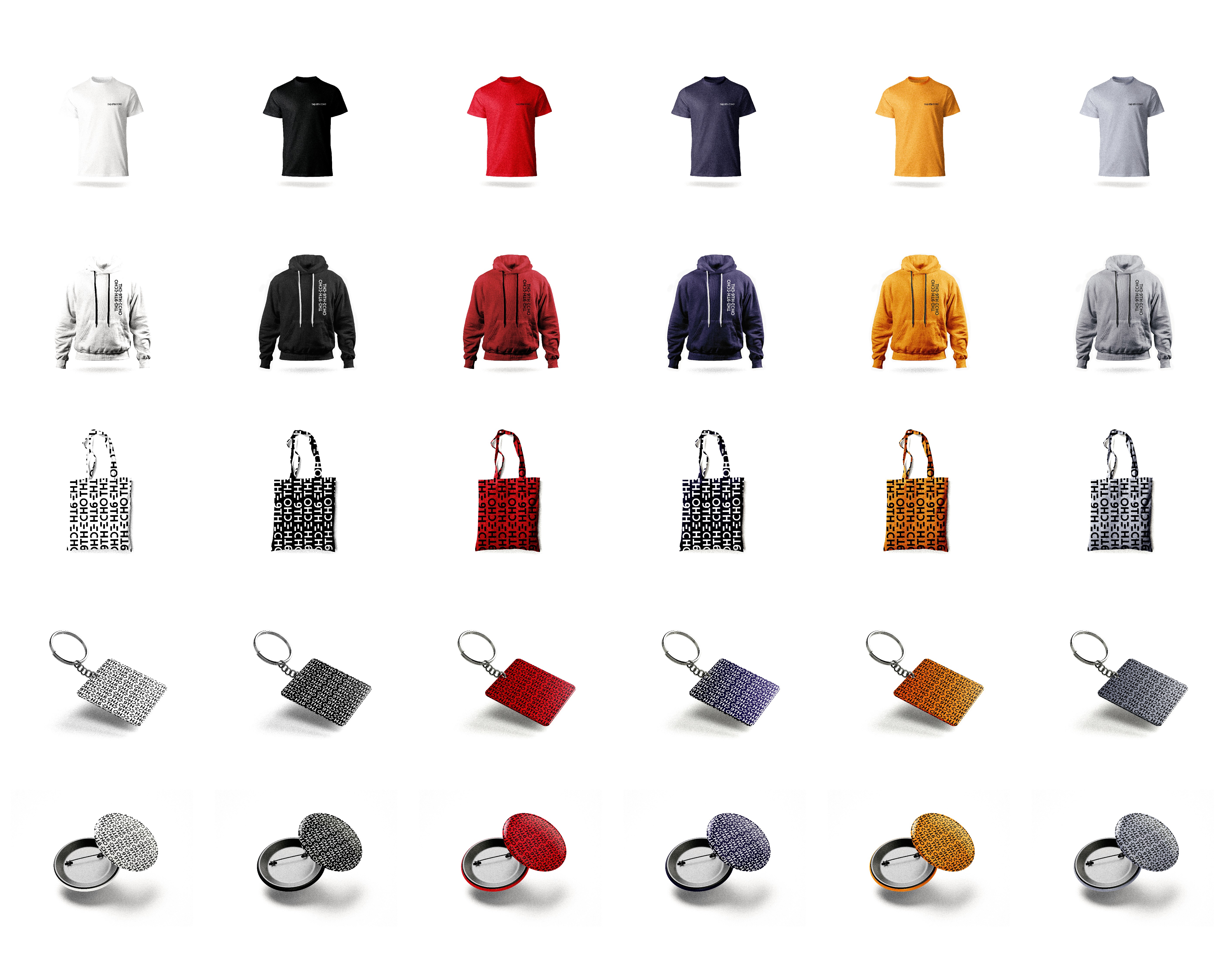
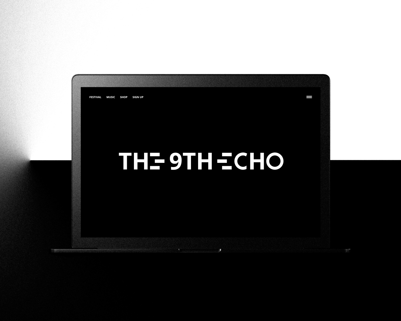
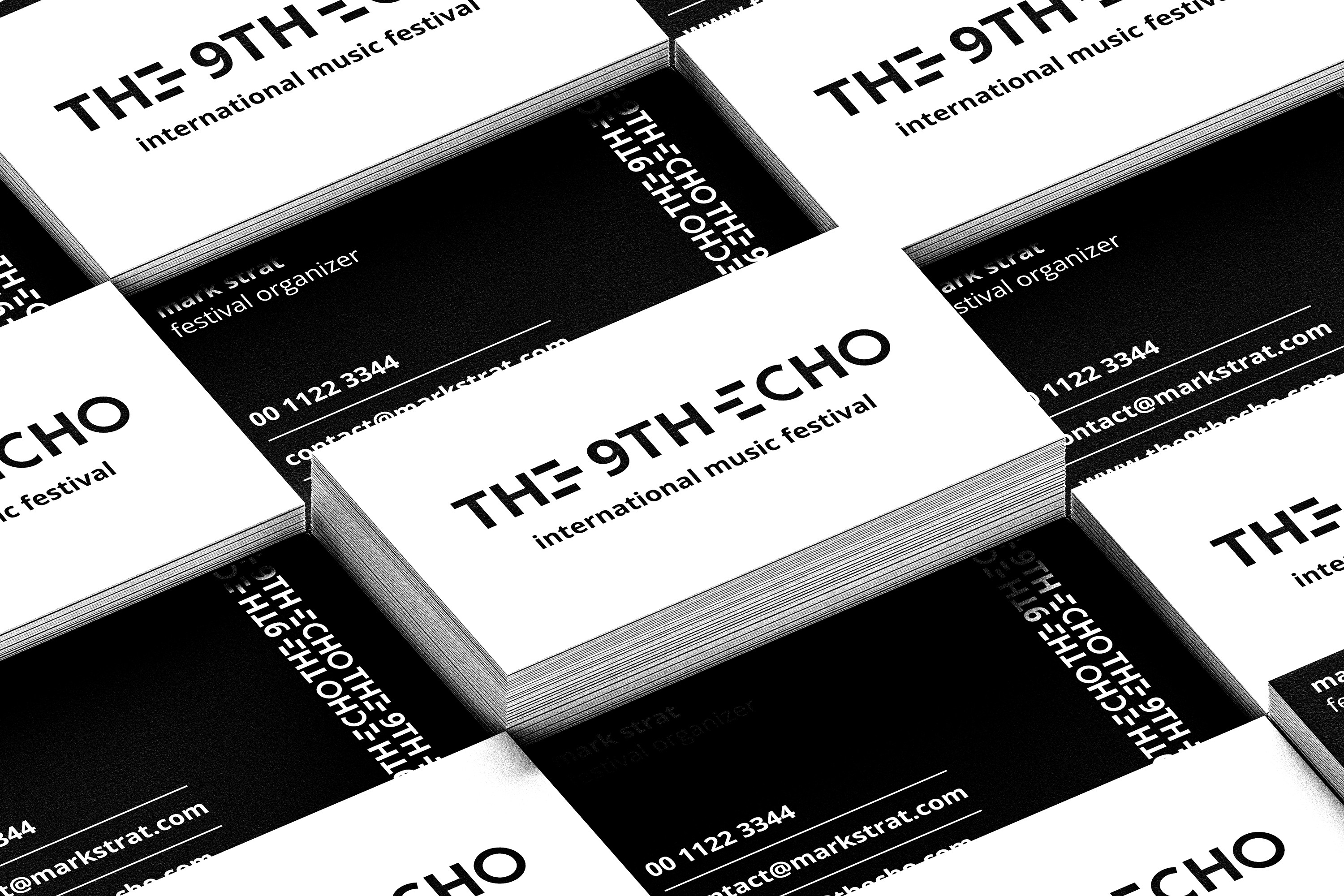
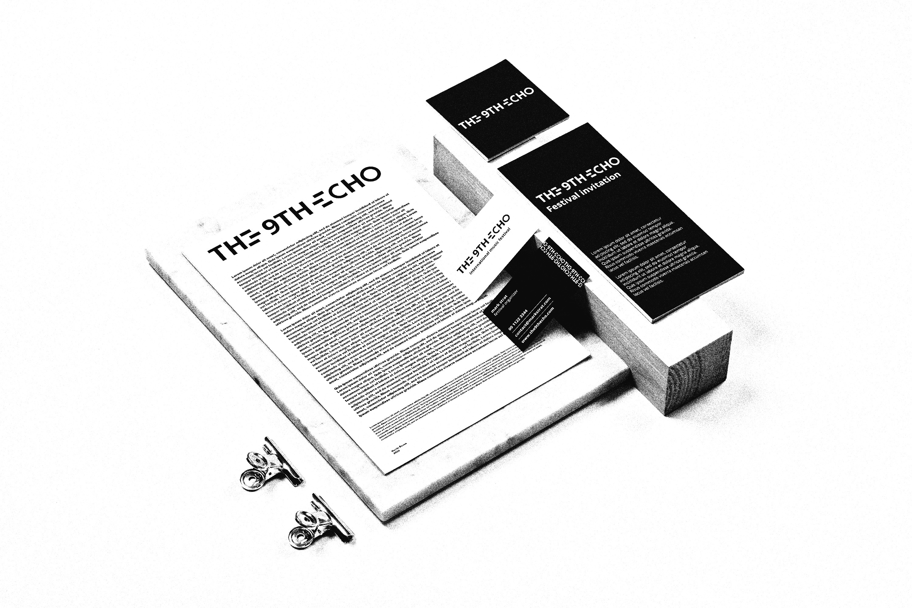
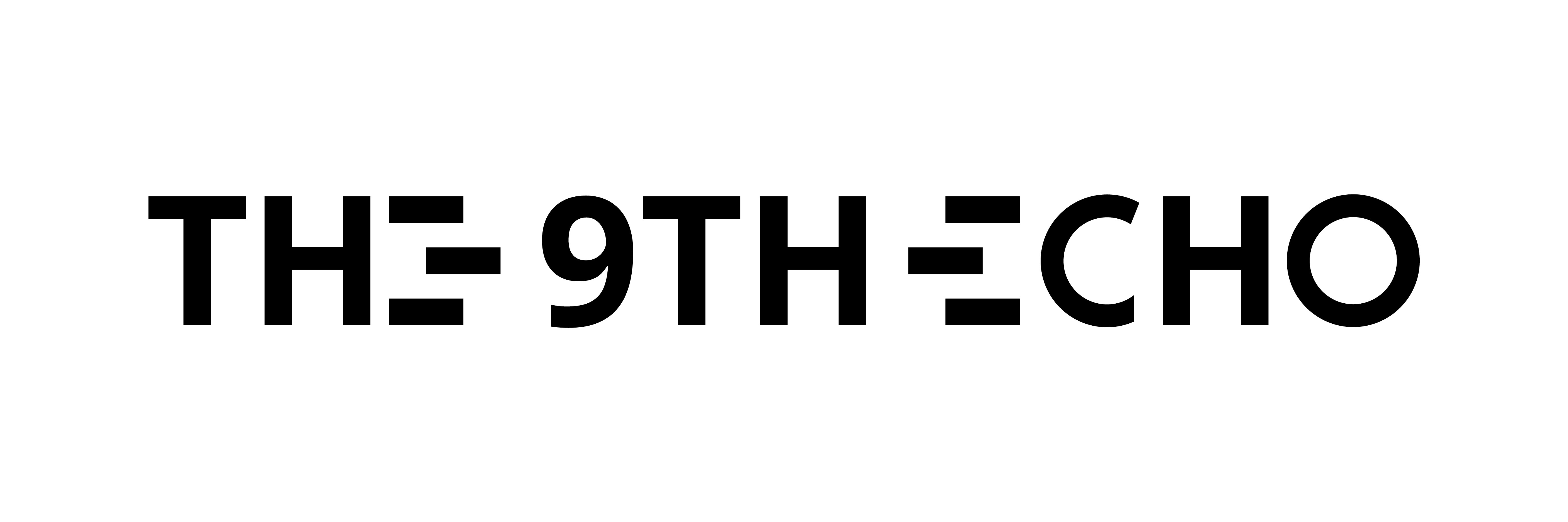
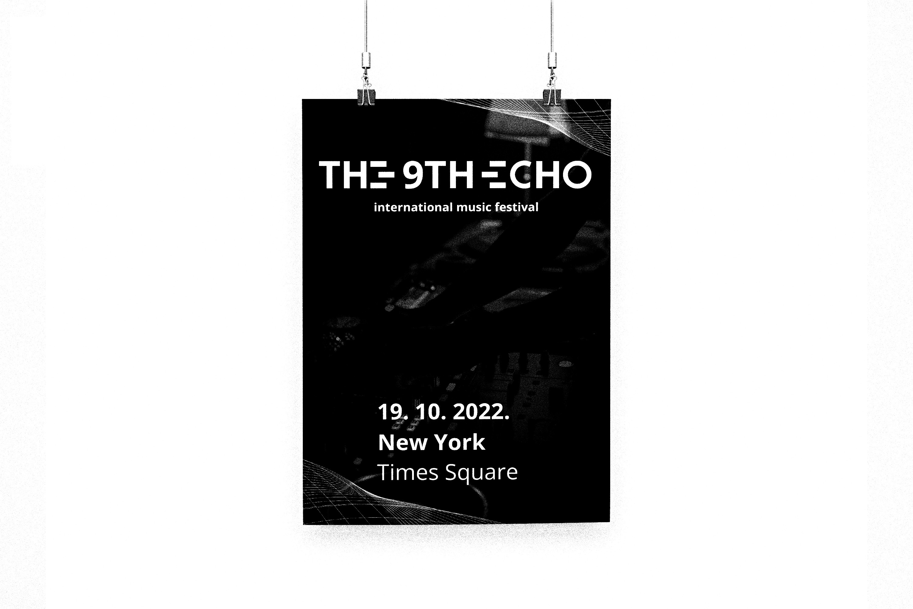
The identity for The 9th Echo merges visual minimalism with conceptual depth, embodying the essence of a global techno festival. Central to the logotype are two custom-designed “E” characters that face each other, symbolizing resonance, repetition, and the immersive quality of sound—core principles in techno music. The modified “9” further personalizes the type, adding a subtle yet memorable twist. Built on the solid structure of Open Sans Bold, the design finds harmony between functional typography and expressive detail. This balance makes the branding not only visually compelling but also symbolically rich, capturing the cultural and sonic atmosphere of the event.
The identity for The 9th Echo merges visual minimalism with conceptual depth, embodying the essence of a global techno festival. Central to the logotype are two custom-designed “E” characters that face each other, symbolizing resonance, repetition, and the immersive quality of sound—core principles in techno music. The modified “9” further personalizes the type, adding a subtle yet memorable twist. Built on the solid structure of Open Sans Bold, the design finds harmony between functional typography and expressive detail. This balance makes the branding not only visually compelling but also symbolically rich, capturing the cultural and sonic atmosphere of the event.
The identity for The 9th Echo merges visual minimalism with conceptual depth, embodying the essence of a global techno festival. Central to the logotype are two custom-designed “E” characters that face each other, symbolizing resonance, repetition, and the immersive quality of sound—core principles in techno music. The modified “9” further personalizes the type, adding a subtle yet memorable twist. Built on the solid structure of Open Sans Bold, the design finds harmony between functional typography and expressive detail. This balance makes the branding not only visually compelling but also symbolically rich, capturing the cultural and sonic atmosphere of the event.
The identity for The 9th Echo merges visual minimalism with conceptual depth, embodying the essence of a global techno festival. Central to the logotype are two custom-designed “E” characters that face each other, symbolizing resonance, repetition, and the immersive quality of sound—core principles in techno music. The modified “9” further personalizes the type, adding a subtle yet memorable twist. Built on the solid structure of Open Sans Bold, the design finds harmony between functional typography and expressive detail. This balance makes the branding not only visually compelling but also symbolically rich, capturing the cultural and sonic atmosphere of the event.
Typography
Typography
Typography
Typography
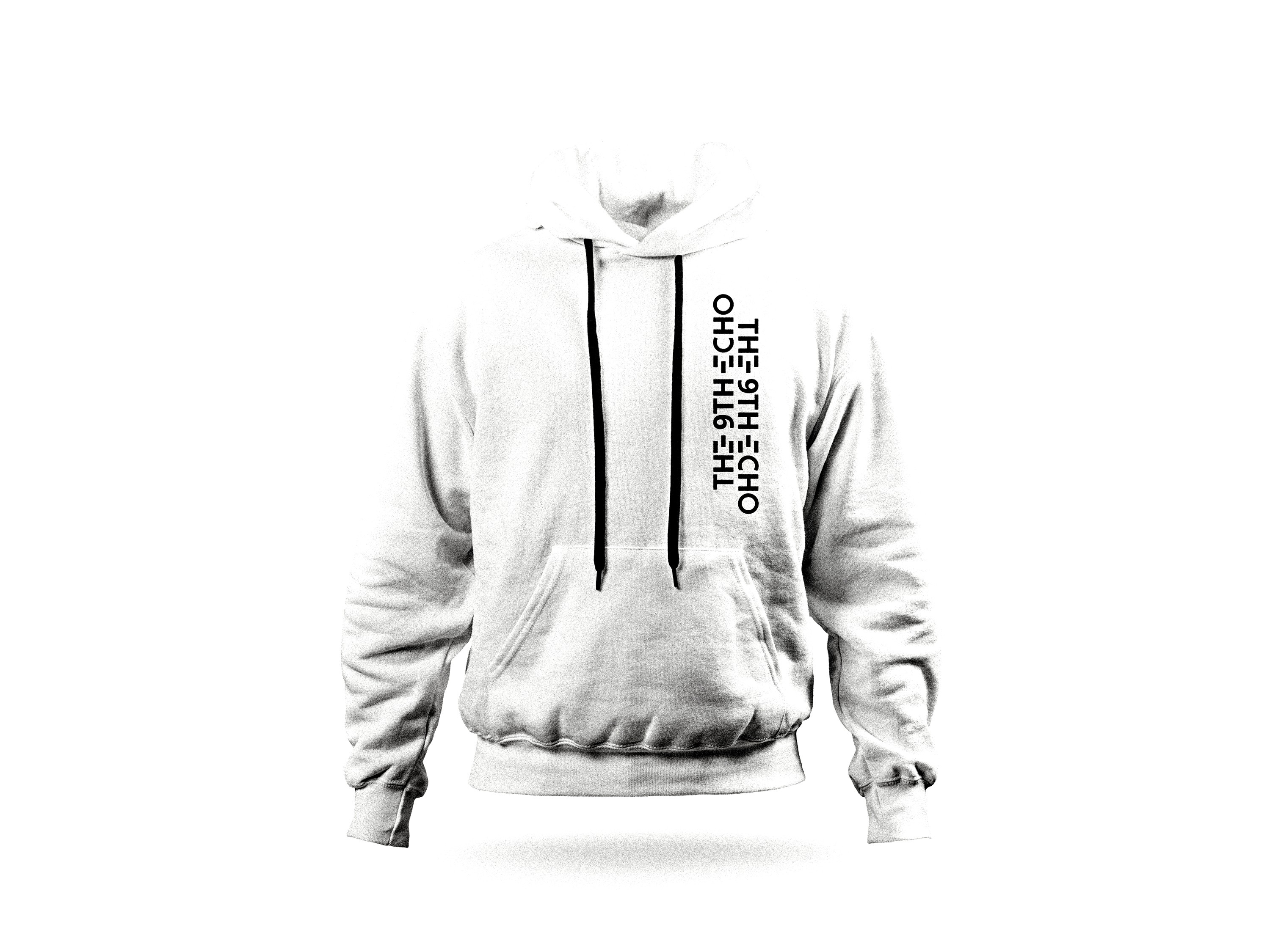
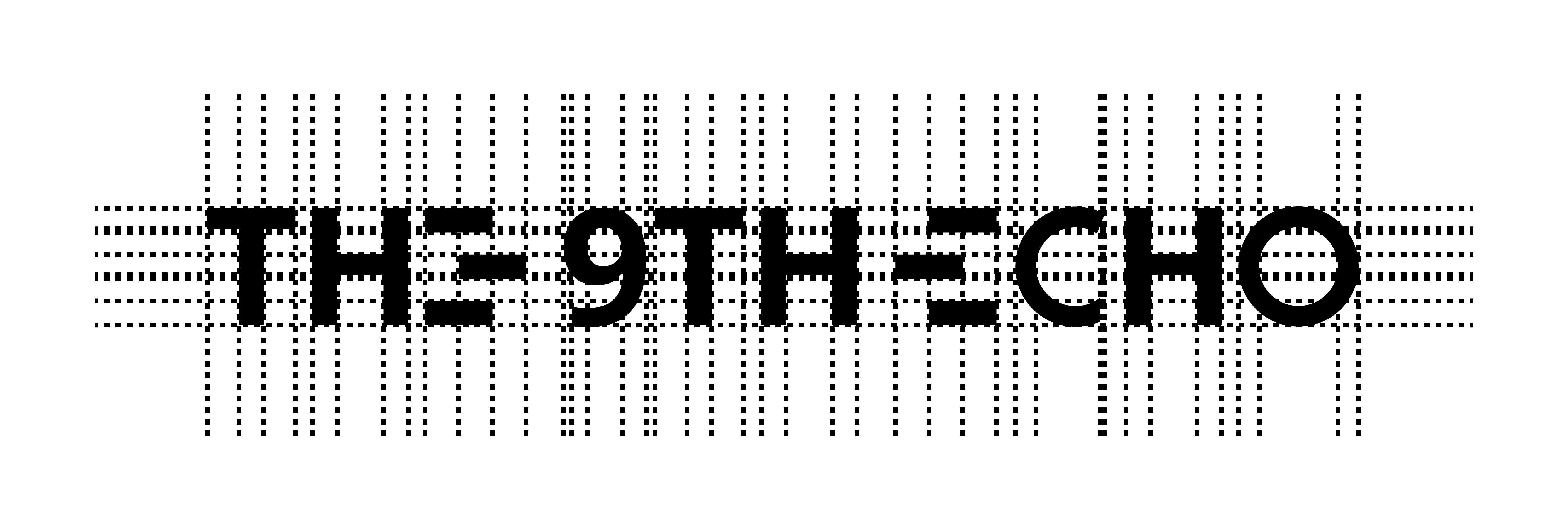
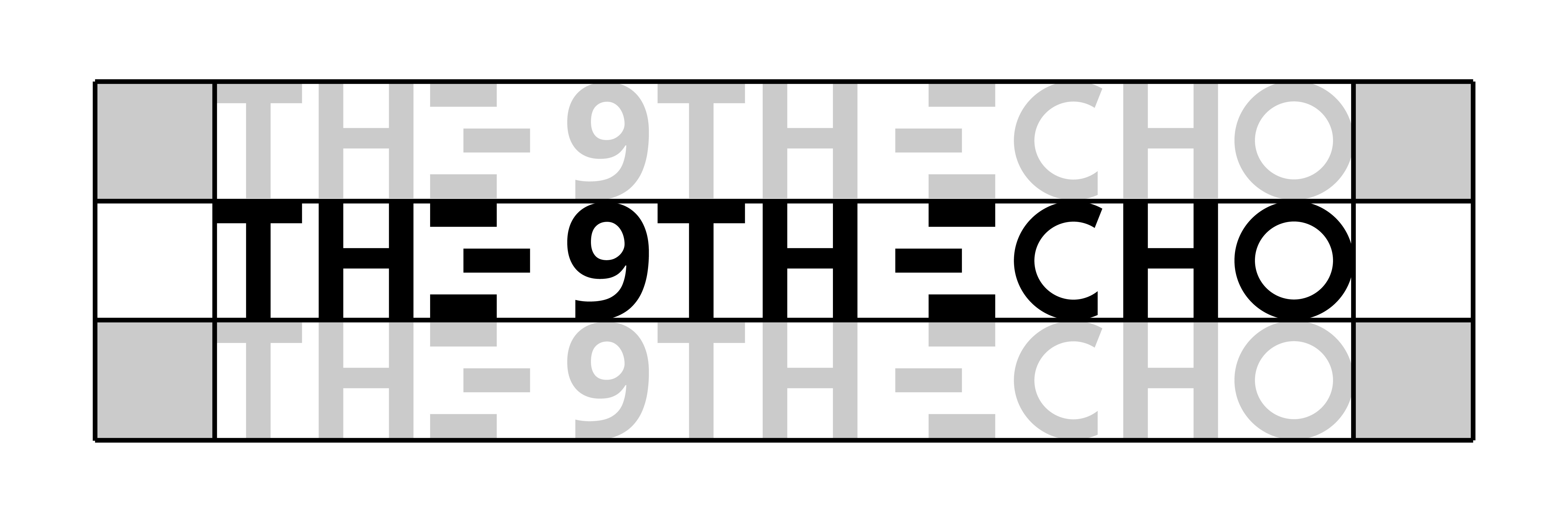
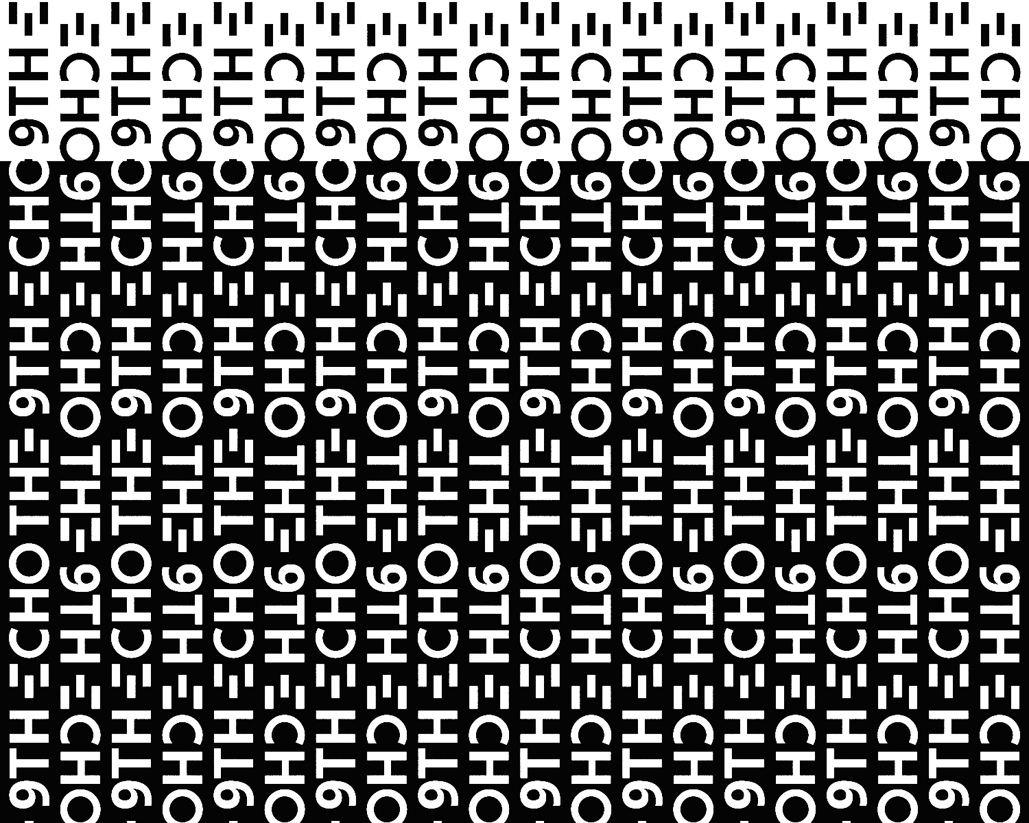
Typography creates a visual rhythm, with each typeface chosen to echo the design’s flow. The spacing, weight, and alignment of letters establish a subtle harmony, making the text not just readable, but an integral part of the experience. This careful balance ensures that the typography supports both the aesthetic and functional elements of the project.
Typography creates a visual rhythm, with each typeface chosen to echo the design’s flow. The spacing, weight, and alignment of letters establish a subtle harmony, making the text not just readable, but an integral part of the experience. This careful balance ensures that the typography supports both the aesthetic and functional elements of the project.
Typography creates a visual rhythm, with each typeface chosen to echo the design’s flow. The spacing, weight, and alignment of letters establish a subtle harmony, making the text not just readable, but an integral part of the experience. This careful balance ensures that the typography supports both the aesthetic and functional elements of the project.
Typography creates a visual rhythm, with each typeface chosen to echo the design’s flow. The spacing, weight, and alignment of letters establish a subtle harmony, making the text not just readable, but an integral part of the experience. This careful balance ensures that the typography supports both the aesthetic and functional elements of the project.


Repetitive Patterns
Repetitive Patterns
Repetitive Patterns
Repetitive Patterns
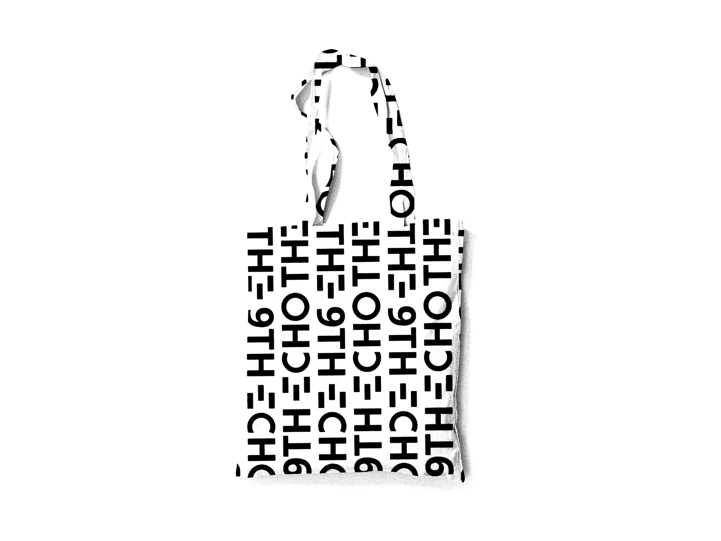
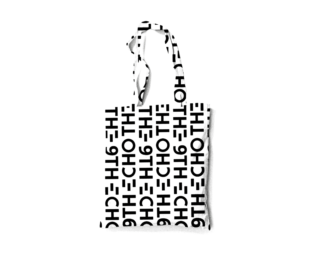
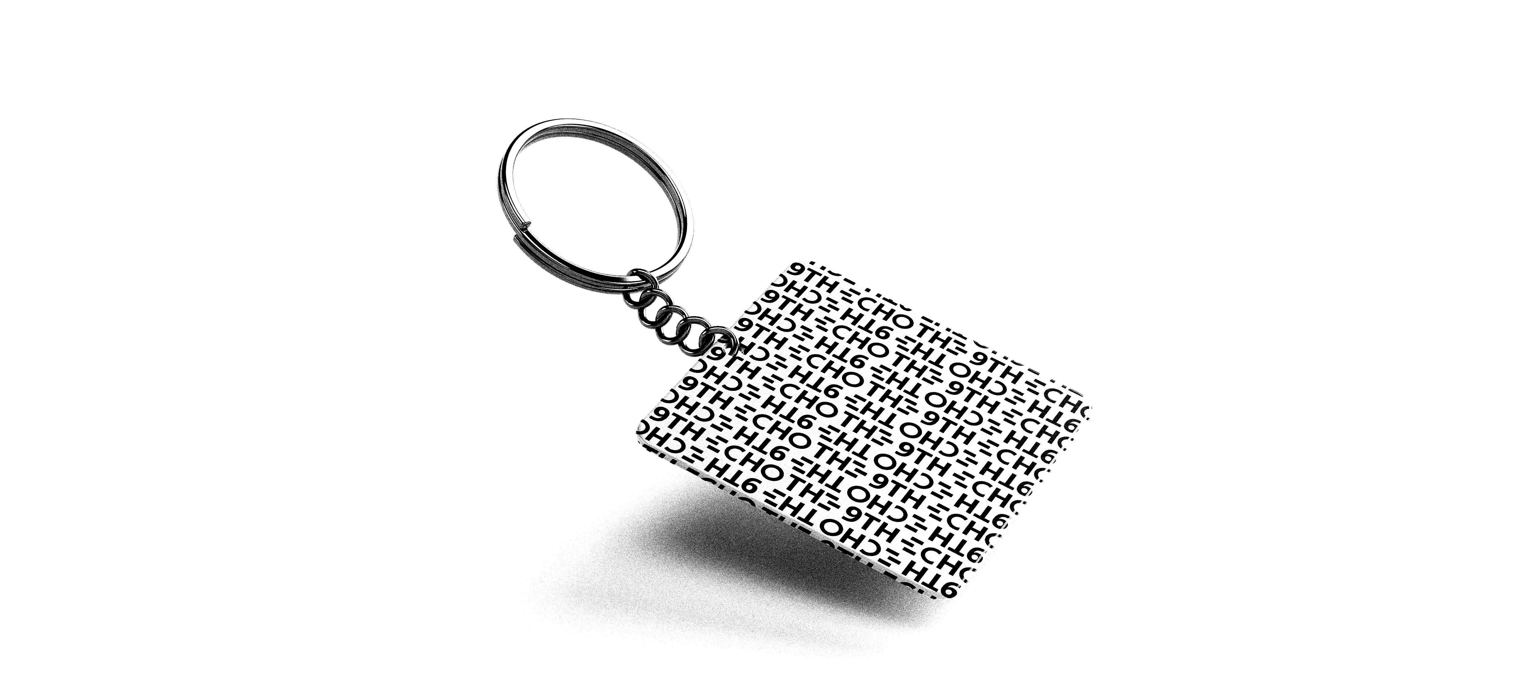
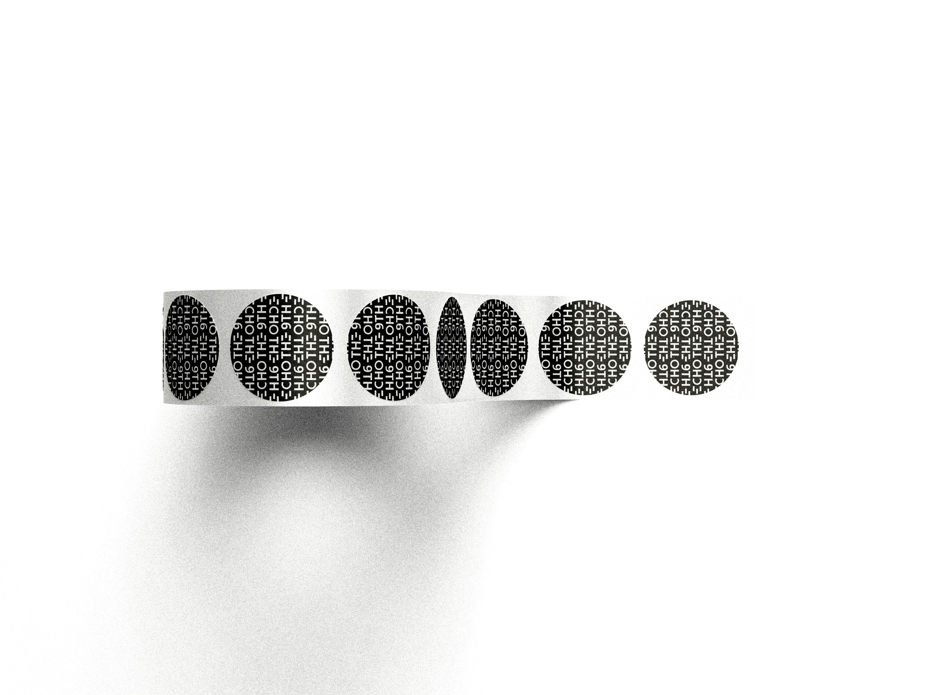
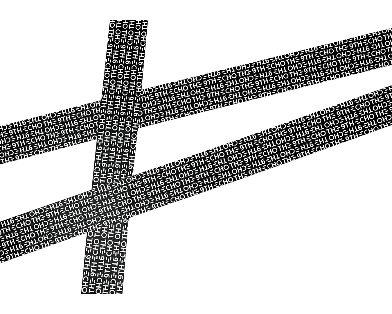
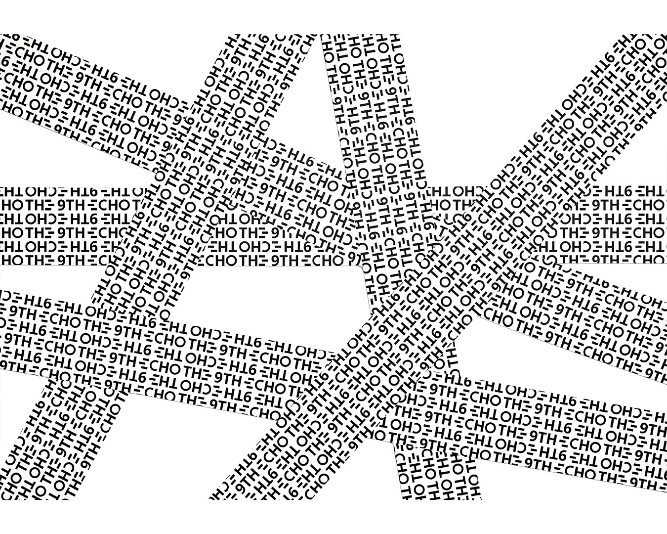
Repetition is key to the project’s structure, with geometric patterns repeating at varying scales. These patterns symbolize how sounds reverberate through space, echoing in continuous cycles. The visual repetitions guide the viewer’s eye, while creating a sense of fluidity and movement that mimics the way sound fills an environment.
Repetition is key to the project’s structure, with geometric patterns repeating at varying scales. These patterns symbolize how sounds reverberate through space, echoing in continuous cycles. The visual repetitions guide the viewer’s eye, while creating a sense of fluidity and movement that mimics the way sound fills an environment.
Repetition is key to the project’s structure, with geometric patterns repeating at varying scales. These patterns symbolize how sounds reverberate through space, echoing in continuous cycles. The visual repetitions guide the viewer’s eye, while creating a sense of fluidity and movement that mimics the way sound fills an environment.
Repetition is key to the project’s structure, with geometric patterns repeating at varying scales. These patterns symbolize how sounds reverberate through space, echoing in continuous cycles. The visual repetitions guide the viewer’s eye, while creating a sense of fluidity and movement that mimics the way sound fills an environment.